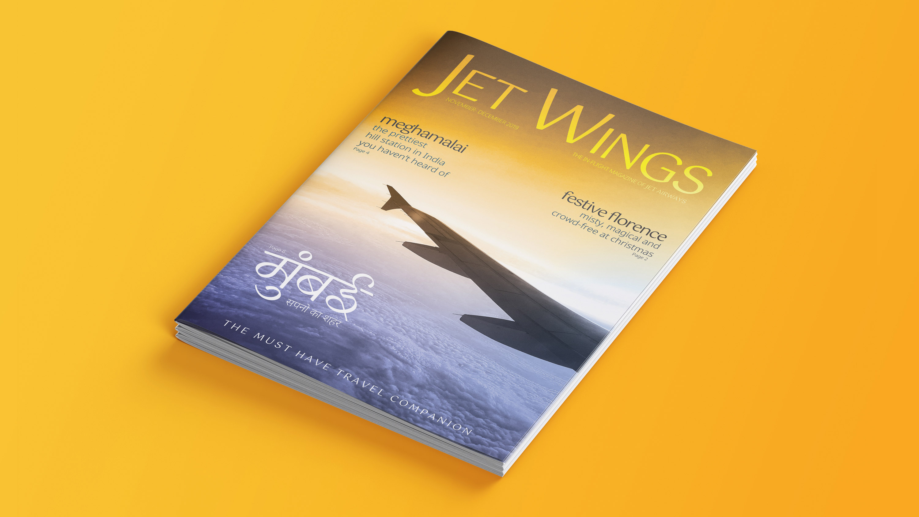
Rebranding Jet Airways
Jet Airways (India) Ltd. is a grounded Indian international airline
based in Mumbai, India which, on 17 April 2019, temporarily suspended
all flight operations. On April 17, the airline has suspended all flight
operations, due to lenders rejecting Rs 4 billion of emergency funding
and its membership in the International Air Transport Association (IATA)
was suspended.
As they ceased operations due to their financial crisis, they
cancelled the flight tickets of many. Even though they refunded the
tickets at that point, right now they have lost their presence among the
travelers. So in the future, when they get resurrected, as a brand
people might not trust them. So, a rebrand is must for them to grow and
to retain back people's trust.
Jet Airways was the first baby born out of 1991 economical
liberalization in India. It was started as a vision to create a world
class airline service that would challenge the major players like
Singapore Airlines and British Airlines. When most of the airlines
companies used their state colours as the primary colours for branding,
Jet Airways branding headed by K.V. Sridhar followed a non-sate owned
symbol which shall be relevant to flying and must represent modern
India.
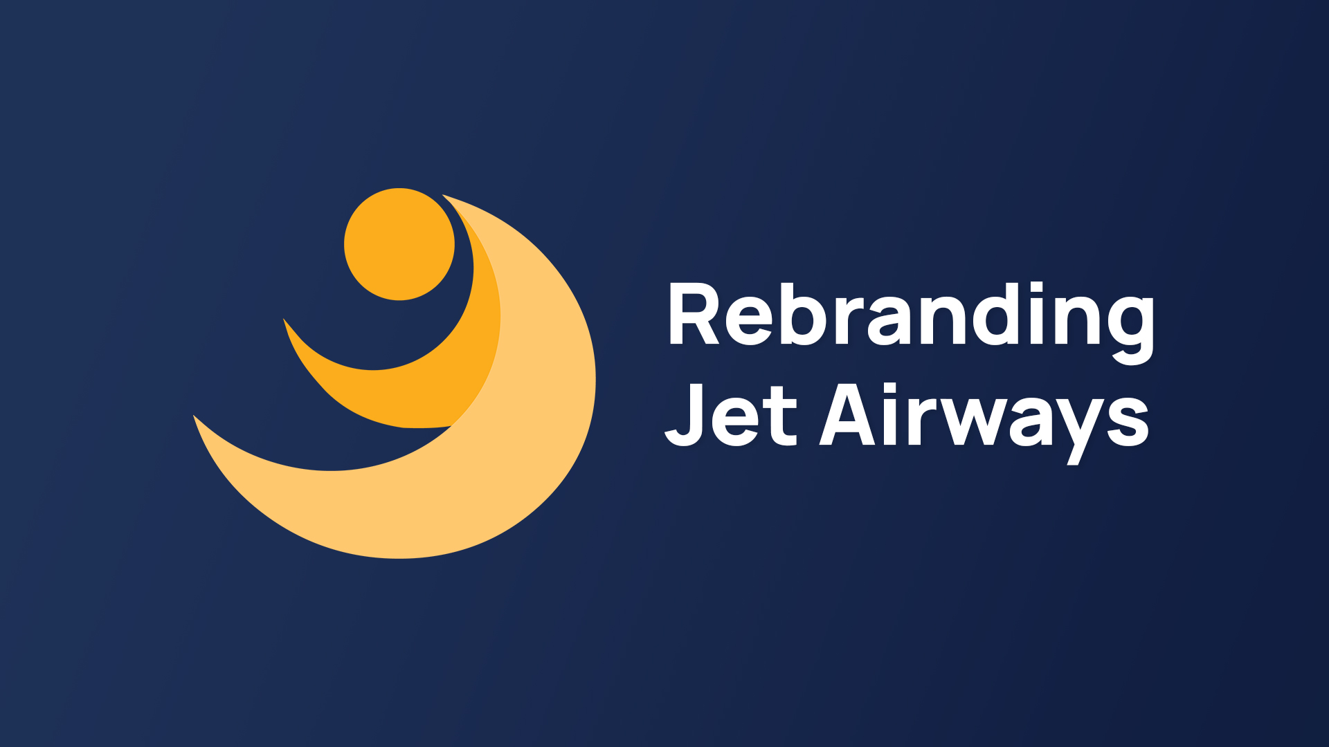
The final logo signifies a sun with the speed lines as the airline
flies. Many called this indescribable logo as the ‘Flying Sun’
Previous Logo
Logo Variation 1
Logo Variation 2
We went ahead choosing the Variation 2 as it does not go well out of the existing established brand so that people will not forget the successful Jet Airways of 2010s while also trust the new brand.
Final Logo
Logo Construction
Logo Journey
Gotu font fits very well with the existing brand.
FONT USAGE: Books, Website, News paper, Multi script, language and goes
very well for both devanagari Multilingual Branding, Signages, Identity,
Display Type and Latin letters.
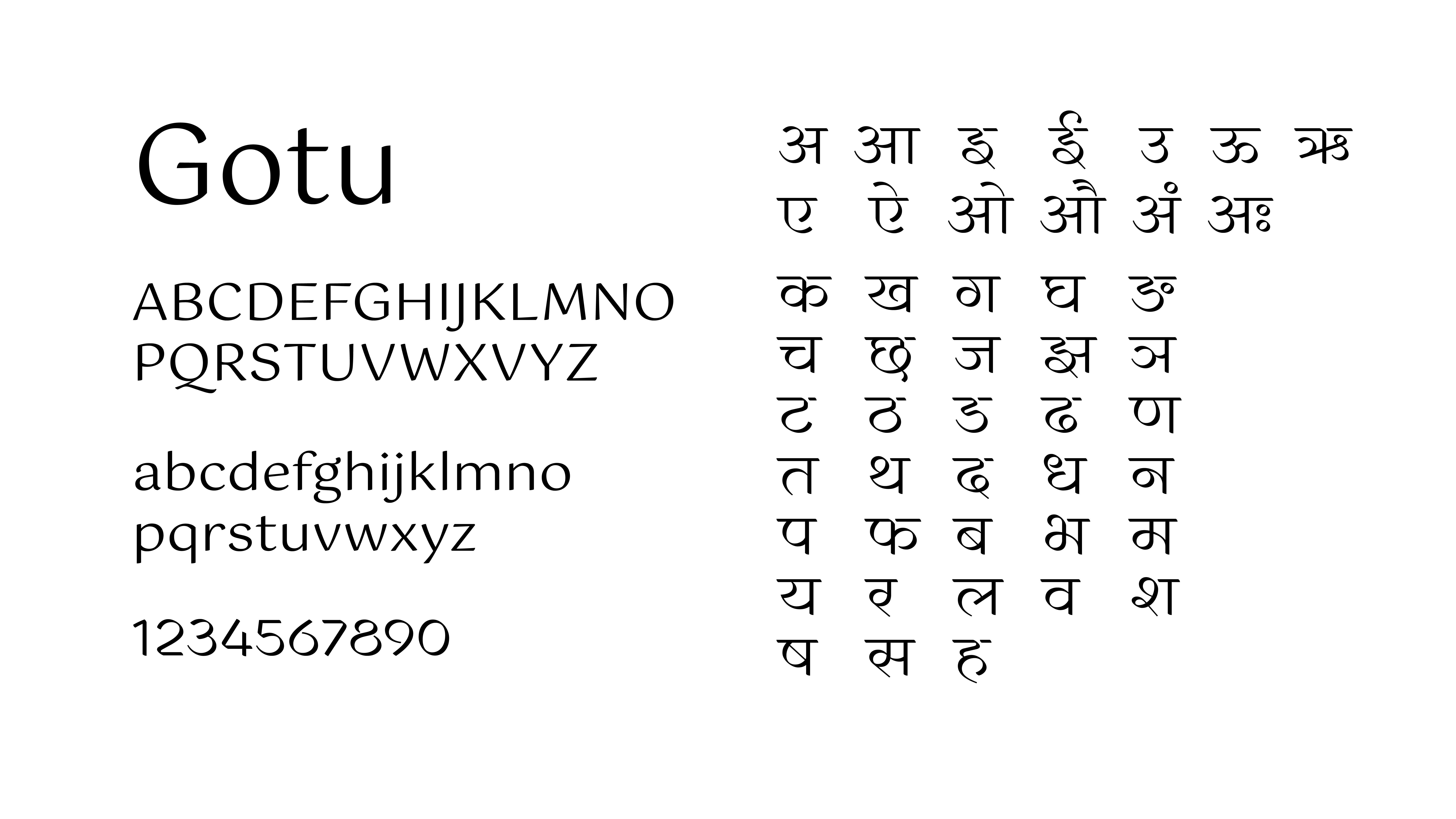
Gotu by Ektype
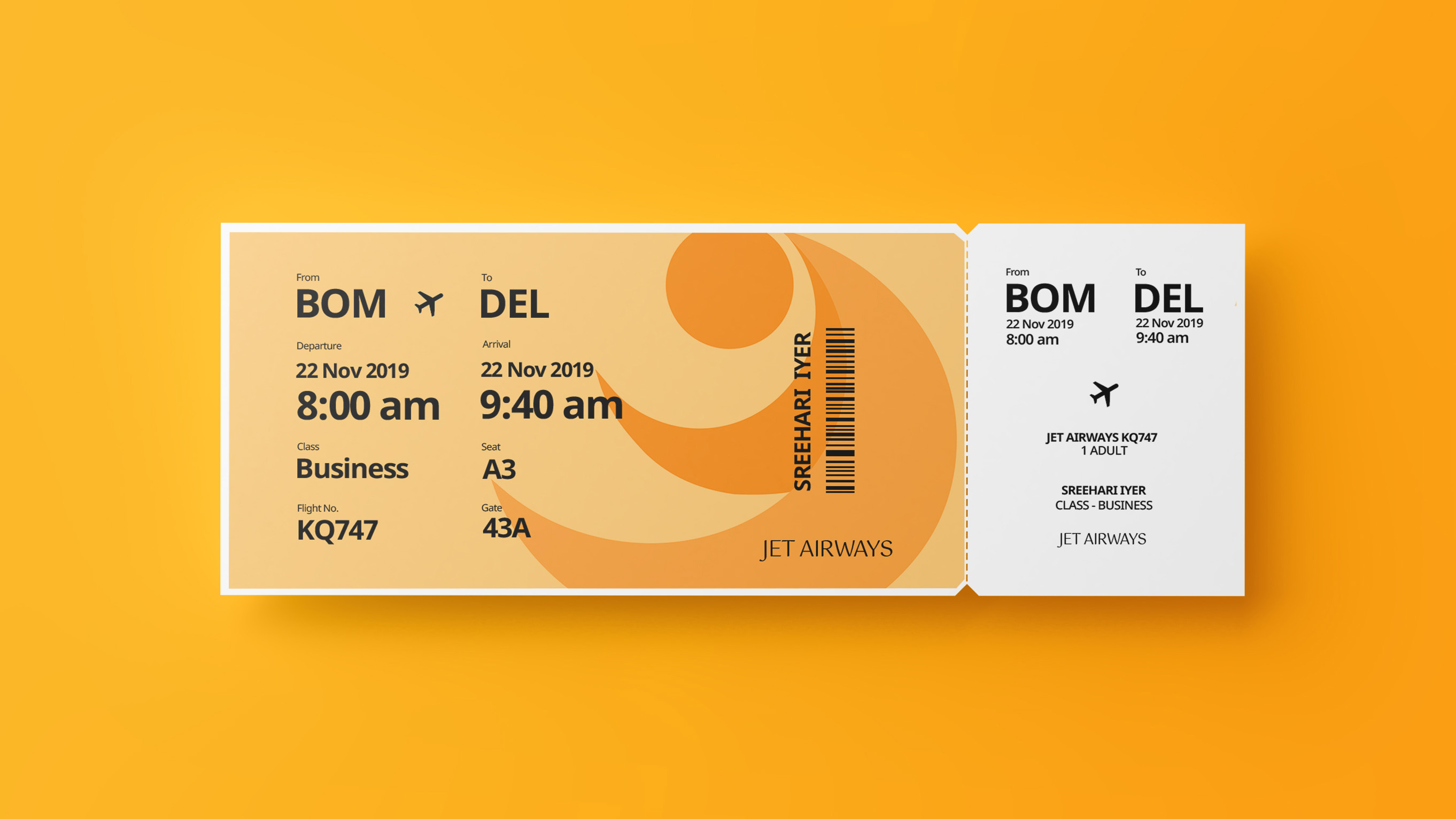
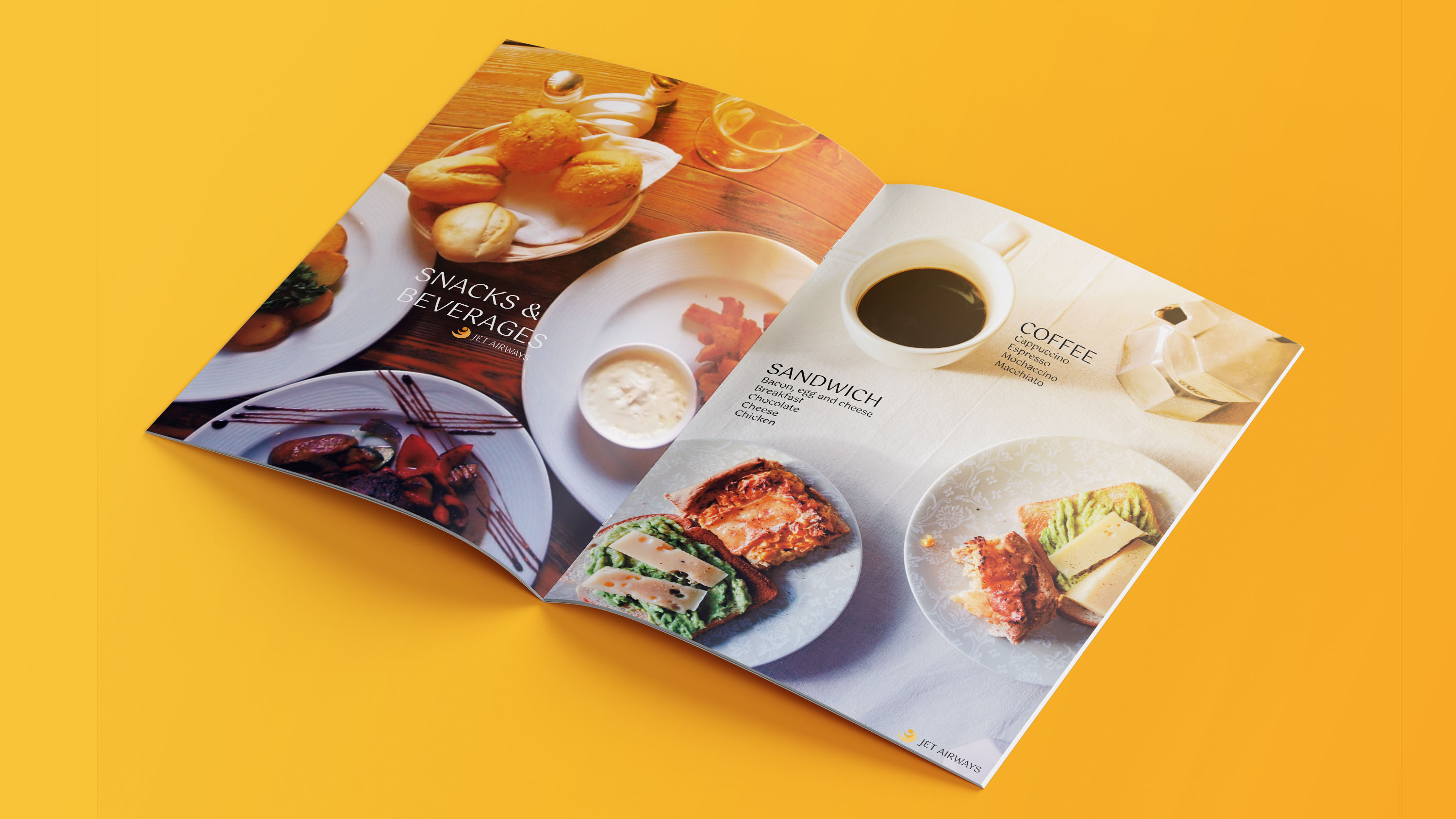
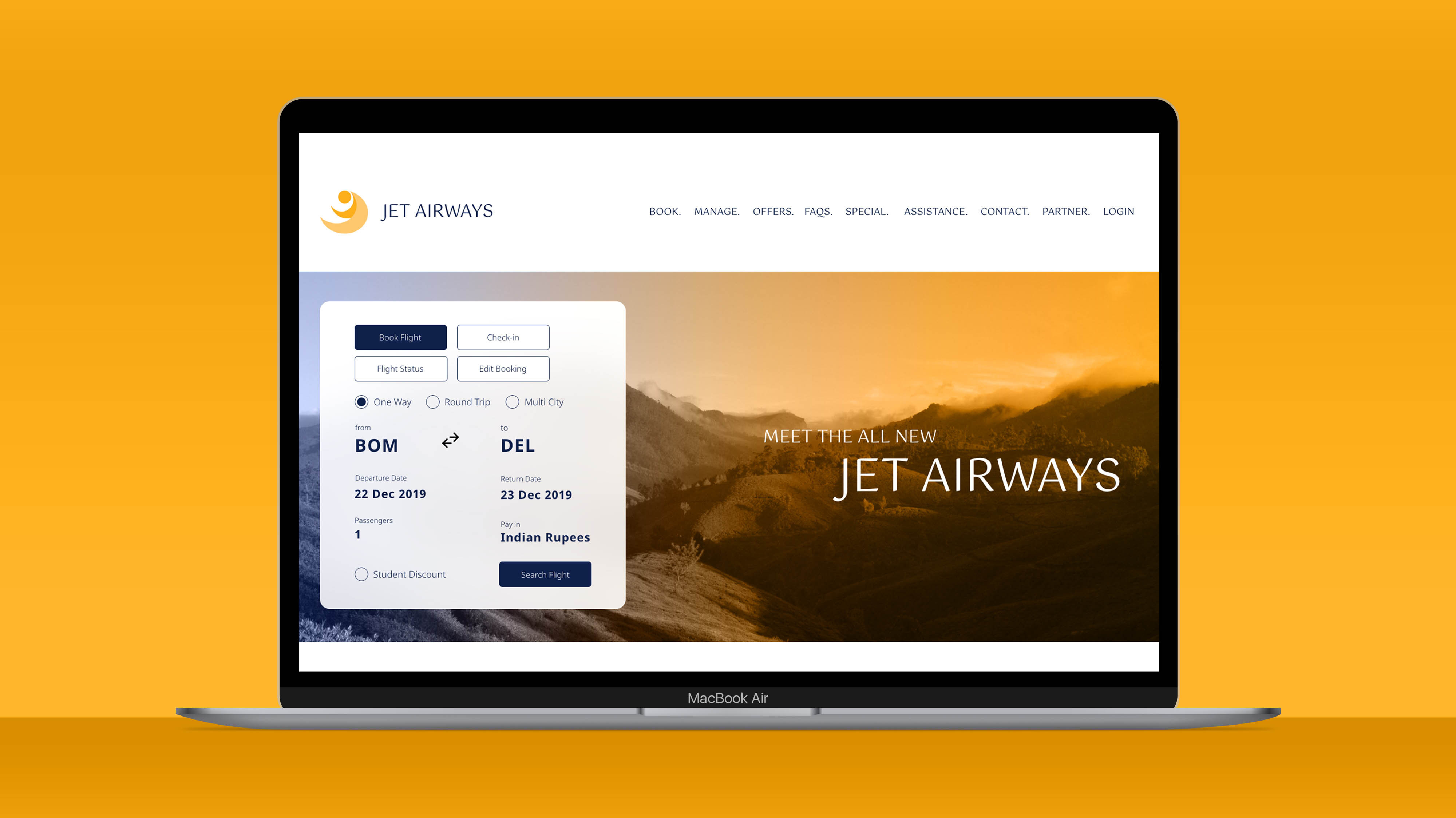
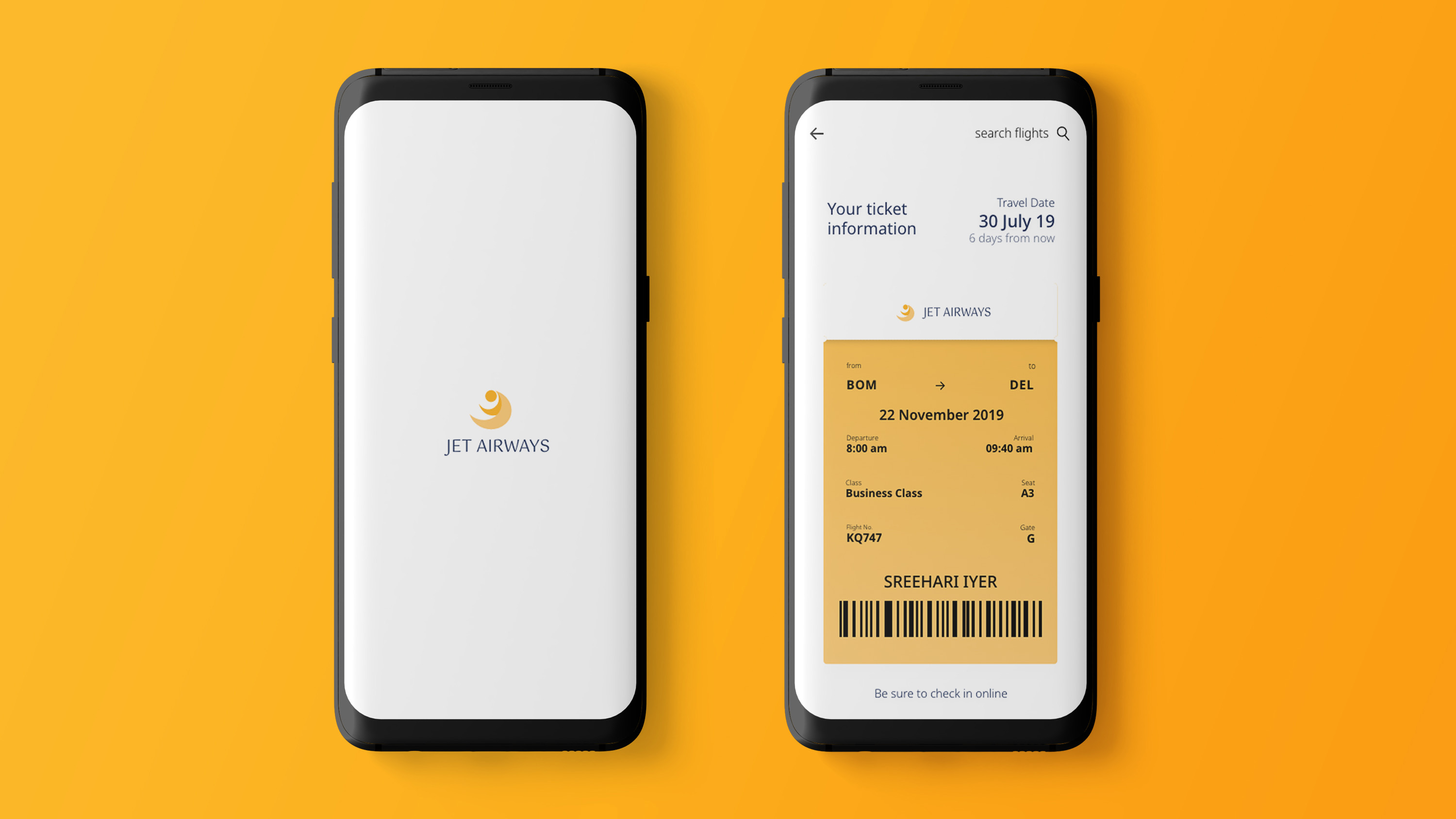
The existing colours of Jet Airways, Oxford Blue and Bright Yellow (Crayola) is retained in the new branding to maintain the well established and unique brand identity. While trustworthiness and royalty is conveyed through the blue, happiness and cheerfulness is conveyed through the bright yellow. Gradients is also followed to give a contemporary touch.

Final Colour Scheme
We secured the first position for the submission!